
Nine Inch Nails - Add Violence EP. The original cover is the front control panel of an extremely dated machine with old dials and a label-maker label saying just "add violence." It fits with nothing else Trent Reznor has done. So I fixed that.
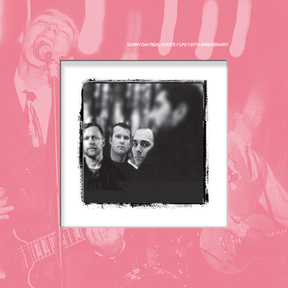
Sunny Day Real Estate's untitled 2nd album (generally referred to as LP2), during which the band broke up (the first time). By its release, the band was done and wanted nothing to do with it. It just had a pink cover and the band's name in 6pt. text. I made a 25th anniv. version (which this year actually is).
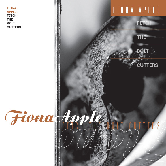
Fiona Apple's newest album, Fetch the Bolt Cutters, is incredible. But the cover is a cut-and-paste nightmare that looks like it was done in five minutes (or even less). So I did a Vaughan Oliver/4AD records homage with the redesign (because he's my favorite designer).

Beck - Hyperspace. His newest album looked to me like someone typed "Beck asian text sportscar" into a Google image search.
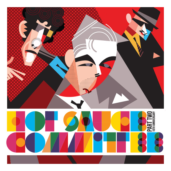
A make-believe 10th Anniversary cover for the Beastie Boys' final album (the 10th anniversary is this year).

The Jon Spencer Blues Explosion's album Orange.
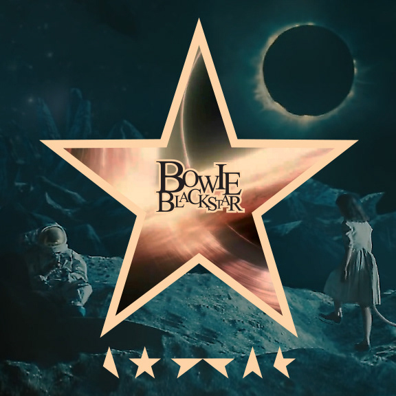
David Bowie's final album Blackstar. The original art was a white background with a simple black star in the middle, but it reacted to light and images changed and the white darkened, etc. The sections of the star at the bottom are from a code created by frequent Bowie collaborator and artist Jonathan Barnbrook, and the characters here say "Bowie." The background painting of the odd tailed girl approaching the dead starman is from the marketing for the album and the video for the title track.
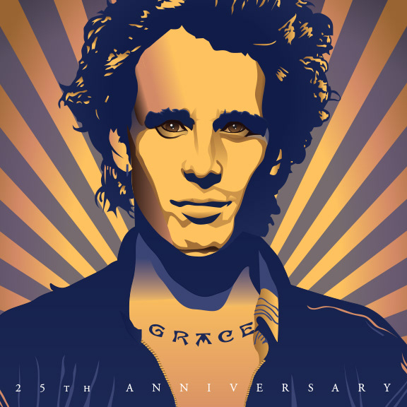
Jeff Buckley's album Grace. Illustration done by me.
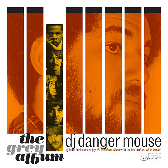
A jazz-inspired rerelease of an album never officially released. Danger Mouse remixed Jay-Z's Black Album using only samples from The Beatles' self-titled White Album, releasing it himself until receiving a cease-and-desist from Apple Records.
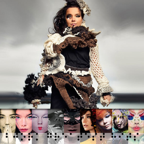
Bjork's Greatest Hits album, which featured a strange line drawing creature on the cover along with the title on the original. Bjork's albums all have a distinct branding to them in that there is no text (with her name stylized in a new, specific-to-that-album way on the back cover, and they're all photos in otherworldly environments, featuring Bjork as a geisha from Mars, a nymph from another world, and, of course, in a black-and-white photo of her in the infamous swan dress. The Greatest Hits did not fit this. So what I thought a proper greatest hits cover might be is a photo of her in her native Iceland, mostly unadorned (her first album, fittingly titled Debut, is a similarly simple photo in a sweater in black and white), with sections of all the otherworldly journeys represented on the compilation. So here it is. Yes there's text, but it's braille, so it's kind of cheating, but not really.
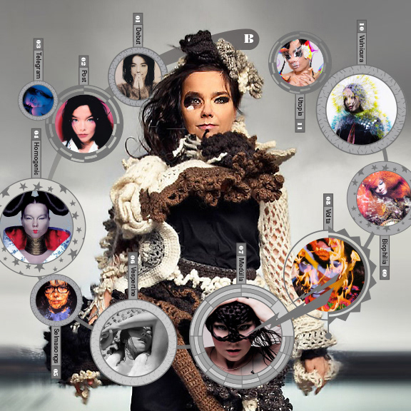
A second idea and shot at Bjork with her various albums orbiting her.

A non-existent Greatest Hits album from Rage Against the Machine, just because I thought their vibe would be fun (with the idea for the text across the bottom borrowed from Public Enemy).

Sonic Youth's Dirty album. By far their most "concrete" (read: "least abstract") album. Actual songs! The producer of Nirvana's Nevermind! Designer Mike Kelley's album cover featured just the orange crocheted thing next to Garfleld on the cover, so I figured I'd show where it might have ended up: in a pile of dirty toys at a landfill where kids skateboard over and around them.
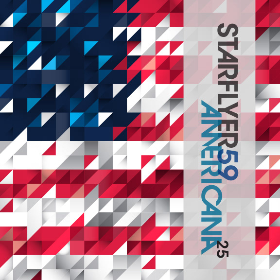
Starflyer 59's third album, Americana. I'm sure any big-time Starflyer fans would complain that it doesn't keep the color palette they started with (first album is a blank silver cover, 2nd is gold, this one is red). The banner with the band name and title would be a sash of tracing paper a la New Order's Low-Life. So the cover can have it or not have it when viewed.

Another Vaughan Oliver-influenced piece. Kim Deal went from a day job with the Pixies and a side project with The Breeders to The Breeders as her full-time gig. Somewhere in there, she put out a one-off single under her own name. The artwork for it literally looks like a white 45 sleeve with a 45 label peeking through the hole. So I made this.
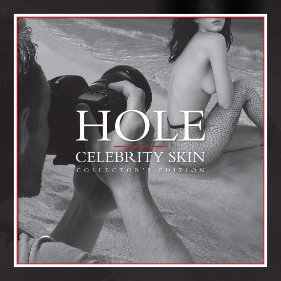
Hole's Celebrity Skin. Model photo by Mark Seliger. Photoshop work by me.

The Choir's Burning Like the Midnight Sun, given a new design direction. Calligraphic text based on a piece by Jason Pickersgill.
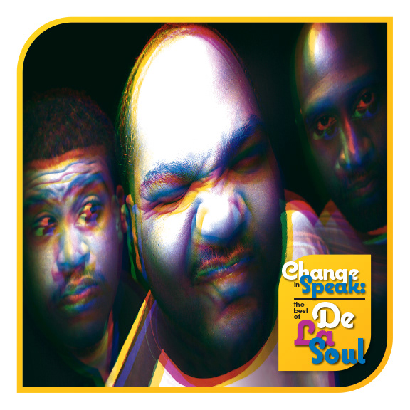
A made-up Best of compilation for the hip-hop group De La Soul.
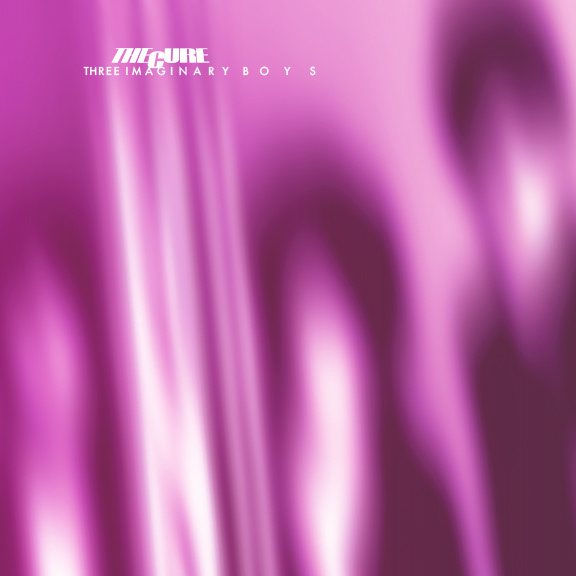
Each of The Cure's first four albums were of a piece artistically. Except this one, which featured a photo of a refrigerator, lamp, and vacuum cleaner on a pink background. I kept the color, and made it fit with the others.
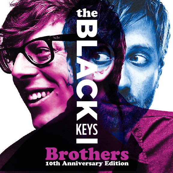
The Black Keys are currently working on a 10th Anniversary package for their album Brothers. I figured I'd help them out by designing a new cover for them.

Redesign of the latest Vampire Weekend record. Its real cover looks like it was made from clip art.
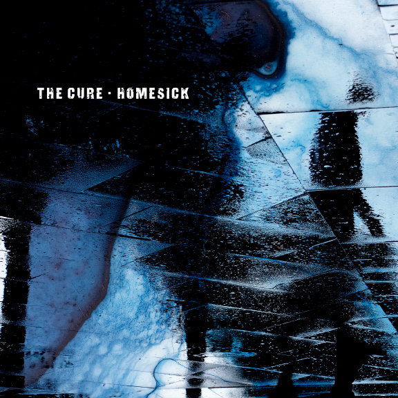
I wanted to do something related to one of my favorite records, The Cure's Disintegration, but I like that cover just the way it is. So I designed a single sleeve for the song "Homesick," from Disintegration, which is one of the saddest songs I know.
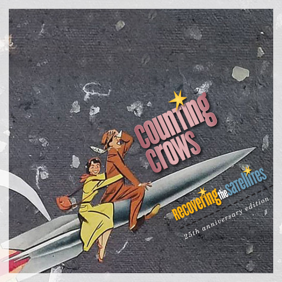
A new direction for Counting Crows' Recovering the Satellites. Artwork by Jenny Davis.
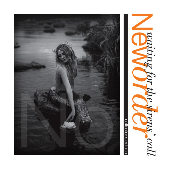
New Order's 2005 album Waiting for the Sirens' Call. Not my favorite of theirs, but it is the one with my least favorite cover.

A 20th Anniversary edition for Damien Rice's album O. Illustration by me.
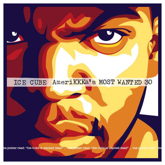
Ice Cube's debut album after leaving N.W.A is celebrating its 30th anniversary this year. I gave it a fresh look for that purpose. Illustration by me.
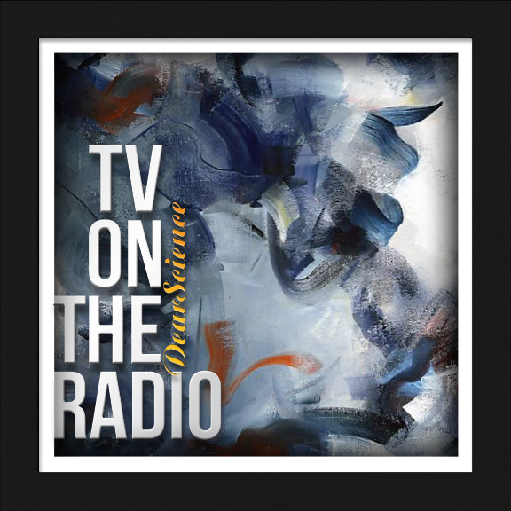
Probably my favorite TV on the Radio album, but with my least favorite cover. So I fixed it. Painting is "Hostias II" by Ritchard Rodriguez.

A redesign of The Juliana Theory's best of compilation, A Small Noise, which only ended up covering their first few years.

A new cover for the debut from a band made up of former members of seminal hardcore and post-hardcore bands Quicksand, Gorilla Biscuits, CIV, and Youth of Today. Band name and title font borrowed from Michael Doret's design for Kiss's Rock And Roll Over album.

Came across this old Buddy Holly retrospective the other day. My parents owned it when I was little, and miraculously, I still know just about every word. I decided to modernize the cover a little...
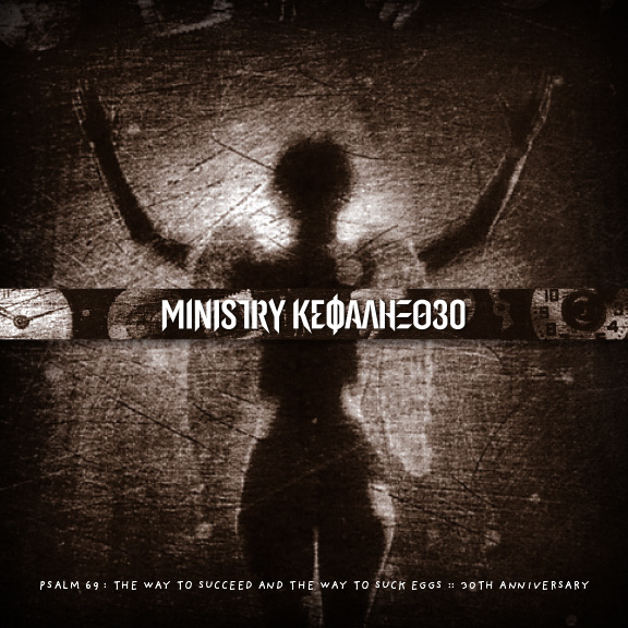
Ministry's Psalm 69, which I tried to simplify and make a bit easier to read for an anniversary package. I love the image, which was done by Paul Elledge, and was three images printed on top of each other in one print - the angel, the timepieces and such, which were around the outside originally, and the distortion/scratches.
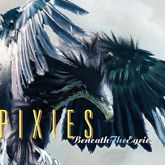
A redesign and redirection for the Pixies' 2019 album, Beneath the Eyrie, really the only one of theirs I wasn't impressed with, artwork-wise. Illustration by a painter who goes by Calimero.
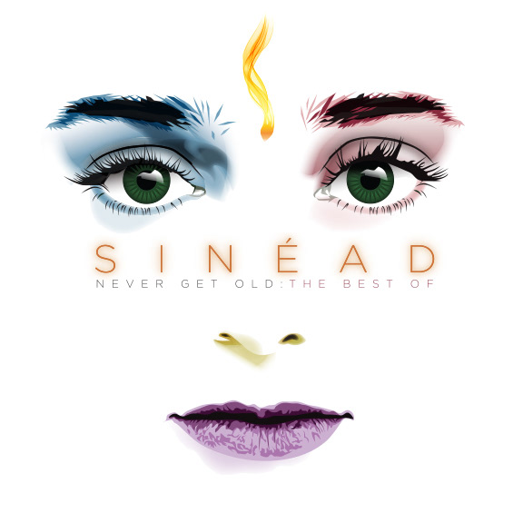
A made-up Best Of compilation for Sinéad O'Connor. Illustration by me.
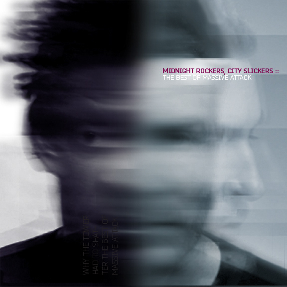
A design for a best-of by massive attack, made using the faces of both members, and titled from the first lyrics on their first album.